How to Read a Piper Diagram
A Piper diagram is three plots in one: two triangles that split the cations and the anions, and a diamond that combines them into a water type. This is how the projection works, why the axes are milliequivalent percentages, and what the patterns mean.
Updated
Three panels, one sample, one point in each
A Piper diagram is not one plot but three, arranged so that a single water sample appears as three points that are geometrically linked.
The lower-left triangle carries the major cations, grouped into three: calcium, magnesium, and sodium plus potassium combined. The lower-right triangle carries the major anions in the same way: chloride, sulphate, and bicarbonate plus carbonate combined. Each triangle is an ordinary ternary plot — three proportions summing to 100%, so two of them fix the third and the composition lands at one unique point.
The central diamond is where the classification is actually read. A sample's position in it is found by projecting its cation point up and to the right, and its anion point up and to the left, until the two rays meet. Because the diamond is a parallelogram built on the two triangles, that intersection is unique, and it encodes both halves of the chemistry at once.
Grouping sodium with potassium, and bicarbonate with carbonate, is not laziness. Potassium is a minor constituent in almost all natural groundwater and behaves like sodium on this plot; carbonate is only present above about pH 8.3 and is the same alkalinity species as bicarbonate in any practical sense. Splitting them out would add two axes and no information.
Why milliequivalents, and not mg/L
A laboratory certificate reports milligrams per litre. A Piper diagram cannot use them. The plot is about which ions balance which other ions, and balance is a matter of electrical charge, not of mass. A milligram of calcium carries roughly twice the charge of a milligram of sodium, because calcium is divalent and lighter per unit of charge.
The conversion divides the mass concentration by the ion's equivalent weight — its molar mass divided by the magnitude of its charge:
| Ion | mg/L | ÷ equiv. weight | meq/L |
|---|---|---|---|
| Ca²⁺ | 60.1 | 20.04 | 3.00 |
| Mg²⁺ | 17.0 | 12.15 | 1.40 |
| Na⁺ | 25.3 | 22.99 | 1.10 |
| K⁺ | 3.91 | 39.10 | 0.10 |
| Cl⁻ | 37.2 | 35.45 | 1.05 |
| SO₄²⁻ | 50.4 | 48.03 | 1.05 |
| HCO₃⁻ | 214 | 61.02 | 3.51 |
Look at what happened to chloride and sulphate. By mass, sulphate outweighs chloride by 35% — 50.4 against 37.2 mg/L — and a reader working from the certificate would call this a sulphate-leaning water. In milliequivalents the two are identical to three figures, 1.05 each, because sulphate is divalent and half again as heavy per mole. Plotting mg/L on a ternary axis would have moved this sample visibly towards the sulphate vertex for no chemical reason at all.
Summing the two halves gives 5.60 meq/L of cations against 5.61 meq/L of anions.
The charge balance check, before anything else
Water is electrically neutral. If an analysis is complete and accurate, the cations and anions must sum to the same number of milliequivalents, and the degree to which they fail to is a direct measure of how much the analysis can be trusted. The charge balance error expresses that as a percentage:
CBE = 100 × (Σ cations − Σ anions) ÷ (Σ cations + Σ anions)
For the analysis above that is 100 × (5.60 − 5.61) ÷ 11.20 = −0.06% — as good as a real analysis gets. The usual acceptance criteria are that under ±5% is fine for routine major-ion work, ±5 to ±10% deserves a note in the report, and beyond ±10% something is wrong. Almost always it is a missing constituent — nitrate, fluoride, an unmeasured organic acid anion, iron or aluminium in an acidic water — rather than a mistake in the ions that were measured.
Do this first, not last
A Piper diagram normalises each triangle to 100%, which means it will happily plot an analysis with a 40% charge imbalance as a confident-looking point. The plot cannot tell you the analysis was wrong. Check the balance before you interpret anything.
A worked classification
Normalising each half of the analysis to 100% gives the coordinates that actually get plotted.
| Cations | meq % | Anions | meq % |
|---|---|---|---|
| Ca | 53.6 | HCO₃ + CO₃ | 62.6 |
| Mg | 25.0 | SO₄ | 18.7 |
| Na + K | 21.4 | Cl | 18.7 |
No cation reaches 50% by a wide margin, but calcium is clearly dominant at 53.6%, and bicarbonate dominates the anions at 62.6%. The naming convention takes the dominant species on each side, so this is a Ca–HCO₃ water: the classic signature of recently recharged groundwater that has dissolved a little calcite and not yet done anything else. Where no species passes 50%, the name carries both leaders — Ca–Mg–HCO₃, for instance — which is why water type names vary in length.
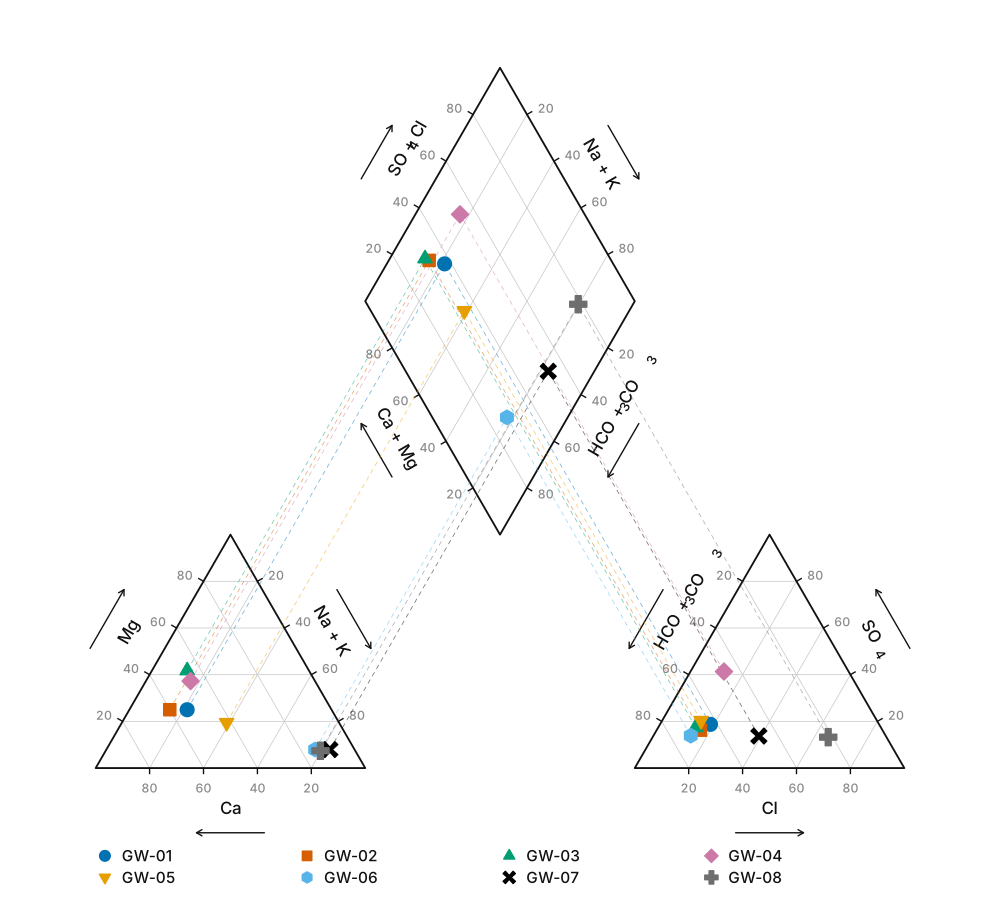
Reading the diamond
The diamond has four corners and each one is a recognisable kind of water.
- Left — Ca–HCO₃. Fresh, young, recently recharged water in a carbonate or silicate aquifer. Alkaline earths and weak acids both dominate. Most shallow groundwater starts here.
- Right — Na–Cl. Alkali metals and strong acids dominate. Seawater, evaporite dissolution, deep stagnant brine, or road salt. In a coastal aquifer, movement towards this corner is the signal you are watching for.
- Top — Ca–SO₄. Alkaline earths with strong acids: gypsum or anhydrite dissolution, acid mine drainage, or oxidation of pyrite in the section.
- Bottom — Na–HCO₃. Alkali metals with weak acids. This is the fingerprint of cation exchange — sodium released from clays in exchange for calcium and magnesium — and is what "naturally softened" water looks like.
The diamond is also divided into six numbered subfields in the original scheme, which distinguish, for example, waters where carbonate hardness exceeds 50% from those where non-carbonate hardness does. In routine practice most people read the corners and the mixing behaviour rather than the subfield numbers.
The patterns matter more than the points
A single sample on a Piper diagram gives you a label. A set of samples gives you a process, and that is where the plot earns its place in a report.
Samples strung out along a straight line in the diamond indicate simple two-component mixing, and the position of each sample along that line estimates its mixing fraction. Freshwater against seawater in a coastal aquifer is the standard case: a sample sitting a third of the way along the line is roughly a third seawater by ionic content.
Samples that curve away from a straight line are telling you a reaction is happening as well as mixing. A swing towards the bottom vertex along a flow path is cation exchange stripping calcium and releasing sodium. A climb towards the top is gypsum dissolution. A retreat of sulphate with depth, against a background of otherwise similar chemistry, is sulphate reduction in a confined, anoxic section.
The eight samples in the figure above trace exactly that sequence — carbonate recharge at the left, a gypsum interbed pushing sulphate up, exchange dragging the mid-flow samples towards the bottom, and a chloride-rich brackish toe at the right. Plotted individually they are eight labels. Plotted together they are a flow path.
What a Piper diagram throws away
Everything is a percentage, so absolute concentration is discarded. A dilute spring and a brine of identical composition plot at the same point. When total ionic strength matters — dilution by recharge, evaporative concentration, a plume against background — use a Stiff diagram, which keeps the scale, or a Schoeller diagram, which keeps every ion on a logarithmic axis. A common convention is to scale each Piper symbol by total dissolved solids, which recovers part of what the normalisation removed.
Keep reading
- How to Read a Stereonet
Stereonets explained: equal-area vs equal-angle projection, great circles vs poles, density contouring, and what a girdle of poles tells you about a fold.
- USCS Soil Classification Explained
The Unified Soil Classification System worked end to end: the group symbols, the decision path with its threshold numbers, when a dual symbol is required, and what the plasticity chart decides.