How to Read a Stereonet
A stereonet turns orientations in three dimensions into points and arcs on a flat disc, so that patterns invisible in a spreadsheet become obvious. This is what each element on the net means, and how to read one without guessing.
Updated
The projection: a sphere squashed onto a disc
Imagine a plane — a bedding surface, a joint, a fault — passing through the centre of a hollow sphere. It intersects the sphere in a circle, and because the top half of that circle mirrors the bottom half, nothing is lost by discarding one. Geologists keep the lower hemisphere, leaving a half-circle of intersection on the inside of a bowl.
The stereonet is that bowl viewed from directly above, every point projected onto the flat disc you are looking at. A plane becomes an arc across the disc: a great circle. A line — a fold axis, a lineation, a borehole trajectory — pierces the hemisphere at one spot, so it becomes a single point.
Two rules follow, and they are what make a net readable at a glance. North is at the top and azimuths increase clockwise, exactly as on a map. And the centre of the disc is vertical, the rim is horizontal: a horizontal plane projects to the rim, a vertical plane to a straight line through the centre. So a shallow plane plots as a lazy arc hugging the rim and a steep one as a tight arc near the centre — and once that is internalised you can estimate a dip to within about five degrees by eye.
Equal-area or equal-angle — the one choice you must get right
There are two ways to do the projection, and they are not interchangeable. They look almost identical at a glance, which is precisely the problem.
The equal-area net — the Schmidt net, or Lambert azimuthal equal-area projection — distorts shapes but preserves area. A patch covering 1% of the hemisphere covers 1% of the disc wherever it sits, so point density on the plot is a true measure of point density on the sphere. That is the only condition under which contouring, mean orientations and "which joint set is dominant" mean anything.
The equal-angle net, the Wulff net or stereographic projection, preserves angles instead. Circles on the sphere stay circles on paper, which makes hand constructions with a compass straightforward and is why crystallographers use it. The cost is that area is stretched towards the rim, so a cluster near the edge looks more spread out than the same cluster near the centre.
The rule of thumb
If you are going to count, contour, average, or say the words "preferred orientation", use equal-area. For angular constructions by hand, or to match a published crystallographic figure, use equal-angle. Then name it in the caption — a net without its projection stated is not reproducible.
Great circles: planes drawn as planes
The most literal way to plot a plane is as its great circle. Below are 50 measurements from a folded sequence: 25 bedding planes, two steep joint sets, and 10 intersection lineations as points.
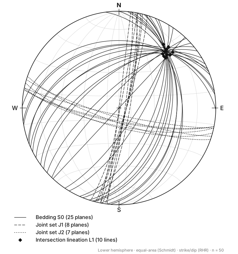
Read individual planes off this and it works well. A strike and dip pair fixes one arc: its two endpoints on the rim give the strike line, and its closest approach to the centre gives the dip. Intersections are just as direct — the point where two great circles cross is their line of intersection, which is how you get the trend and plunge of a fold hinge from two limbs, or of a wedge from two joint sets in a slope stability analysis.
What great circles do badly is population. There are 40 planes on that figure, and the bedding arcs cross so many times that no statistical impression survives. Beyond roughly ten planes a great-circle plot stops being a dataset and becomes a scribble.
Poles: the same planes, one dot each
The fix is to plot each plane not as its trace but as its pole — the line perpendicular to it, which pierces the lower hemisphere at one point. A pole carries the same information as its great circle in one dot, and the geometry inverts in a way that takes getting used to: a shallow plane has a steep pole and plots near the centre, while a vertical plane has a horizontal pole and plots on the rim.
Here is the identical dataset as poles, with density contours underneath.
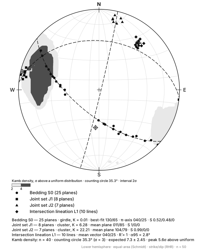
Everything the great-circle plot buried is now legible. Two joint sets are two spots; the bedding poles trace a band; and the ten lineations sit in a cluster whose mean vector is 040/25 — the same orientation, to the degree, as the fold axis recovered from the bedding poles. That agreement between two independent measurements is what a net shows you and a table does not.
Contouring: from a scatter to a density
Past about fifty poles even the dots overlap, and the eye is a poor judge of which of two clumps is denser. Contouring answers that properly: a counting circle of fixed area is swept across the net, the poles inside it counted at each position, and the resulting surface contoured.
The standard method is Kamb contouring, and its virtue is that it sizes the counting circle from the sample size rather than from habit. The circle is chosen so that a uniform distribution of n points would put a set number inside it, and contours are labelled in units of σ above what a uniform distribution would give — so a 2σ contour encloses density two standard deviations above random. On the figure above, 40 poles give a 35.3° counting circle, an expected count of 7.3 ± 2.45, and a peak 5.6σ above uniform: a real cluster, not a lucky pile.
The older 1% area method counts within a circle covering 1% of the hemisphere instead. It is serviceable, but its circle is a fixed size regardless of n, so it over-smooths small datasets and under-smooths large ones.
Contour only on an equal-area net
Contours on a Wulff net are meaningless: the projection stretches area towards the rim, so identical clusters at the centre and at the edge contour differently. It is the most common serious error made with stereonets, and it is invisible unless the projection is stated.
What the patterns mean
Three arrangements cover most of what you will see, and each one is a geological statement.
- A tight cluster of poles — one consistent set of planes. The mean pole is the mean orientation, and the spread of the cluster measures how variable the surface is. Two or three clusters mean two or three joint sets, which is what a rock-mass characterisation is after.
- A girdle — poles spread along a great circle rather than piled up: the signature of folding. The planes have been rotated about one axis, so their poles must lie in the plane perpendicular to it. The pole to the best-fit girdle is the fold axis, and the construction is the π-axis method.
- A uniform scatter — no preferred orientation, and a result rather than a failed plot. Randomly oriented fractures in a massive intrusive body are a genuine finding, with consequences for permeability and slope stability.
The eigenvalue statistics printed under a net put numbers on that impression. Three eigenvalues S₁ ≥ S₂ ≥ S₃ summing to 1 describe the shape of the point cloud: one large value and two small ones is a cluster, two comparable values and one near zero is a girdle. Woodcock's K condenses that into a single number — above 1 is cluster-like, below 1 is girdle-like. The bedding above scores K = 0.01 with eigenvalues 0.52 / 0.48 / 0, about as pure a girdle as field data produces; joint set J2 scores K = 22.2, an unambiguous cluster.
A reading order that works
- Check the caption for the projection and the hemisphere. Equal-area, lower hemisphere is the structural default; anything else must be stated.
- Check the convention. Right-hand-rule strike and dip direction differ by 90°, so a net plotted under the wrong assumption is rotated a quarter turn — and looks entirely plausible.
- Find north, then read positions as map bearings. Poles near the centre are shallow planes; poles near the rim are steep ones.
- Ask whether the points cluster, girdle, or scatter, and count the populations, before you look at any numbers.
- Only then read the statistics, and check they agree with what you saw. If the eigenvalues say girdle and your eye says cluster, one of you has misread it.
Keep reading
- Rose Diagrams for Structural Data
When to mirror a rose diagram and when mirroring is wrong, how to choose a bin width, and why petal radius should scale with the square root of frequency.
- How to Read a Piper Diagram
The three panels of a Piper trilinear diagram explained, why concentrations must be converted to milliequivalent percentages, and a worked example classifying a real analysis.