Rose Diagrams for Structural Data
A rose diagram is a histogram bent into a circle, and it asks for three decisions before it will draw anything: mirror or not, how wide the bins are, and how petal length relates to count. Each one changes the conclusion a reader draws.
Updated
A histogram that closes on itself
Azimuths are awkward data. They are numbers, but 359° and 001° are two degrees apart, not 358, and a linear histogram of a north-trending population splits it in half and puts the two pieces at opposite ends of the axis. The reader sees two modes where there is one.
A rose diagram fixes that by wrapping the axis into a circle. Azimuths are grouped into sectors — bins — and each sector is drawn as a petal pointing in its own direction, with petal size reflecting how many measurements fell in it. Nothing is split, orientation is read directly as a map bearing, and the shape of the whole population is legible at a glance.
What it gives up is precision. A rose diagram shows trend only; it has no way to carry plunge or dip. For planar data it is showing you strike and saying nothing about how steeply the planes dip. That is often exactly what you want — a lineament map or a palaeocurrent study cares about trend and nothing else — but if dip matters, the plot you need is a stereonet.
The first decision: mirror, or do not mirror
This is the setting that most often produces a wrong figure, and it turns on a question about the data rather than about the plot: does the measurement have a sense of direction, or only a line of orientation?
Data with no sense of direction are axial or bidirectional. A joint striking 040° is the same joint as one striking 220°; there is no "which way". Joints, veins, faults, dykes, fold axial traces, lineaments and fracture traces all behave this way. Each measurement should be counted twice, at its azimuth and at its azimuth plus 180°, so the diagram comes out symmetric about the centre. A rose of strikes drawn without mirroring appears half empty and lopsided.
Data with a sense of direction are directional or unidirectional. A palaeocurrent indicator — a cross-bed foreset, a flute cast, an imbricated clast — records flow towards a bearing. Glacial striae with a determined ice-flow sense, sediment transport directions, and wind measurements are the same. Mirroring these is not a presentational choice; it invents a current that never flowed.
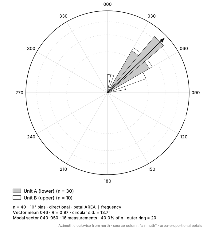
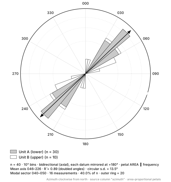
Compare the two. The second is a perfectly plausible figure: symmetric, tidy, publishable. Its statistics even look better behaved. It is simply false, and no reader could catch it from the figure alone — which is why the setting belongs in the caption of every rose diagram you publish.
Mirroring changes the statistics too
The circular mean of axial data cannot be computed the same way as for directional data — averaging 010° and 350° as ordinary numbers gives 180°, the exact opposite of the answer. Axial data are handled by doubling the angles, computing the mean vector, and halving the result. That is why the mirrored figure above reports a mean axis of 046–226 with an R̄ computed on doubled angles, while the unmirrored one reports a mean direction of 046. The two R̄ values are not comparable.
The second decision: bin width
Bin width trades resolution against noise, exactly as it does in an ordinary histogram, and 360 must divide evenly by it. Ten degrees is the default almost everywhere and is a sound starting point, but the right answer depends on how many measurements you have.
| Sample size | Suggested bin | Why |
|---|---|---|
| under ~30 | 15–20° | Wide bins, or single stray readings become petals |
| ~30–150 | 10° | The usual compromise, and the convention |
| over ~150 | 5° | Enough data to resolve real fine structure |
Two failure modes to watch for. Bins that are too narrow turn sampling noise into apparent structure: with 40 measurements in 5° bins you have 72 sectors averaging half a measurement each, and the resulting spiky figure invites the reader to interpret gaps that are nothing but chance. Bins that are too wide smear genuinely distinct sets together — two joint sets 25° apart disappear into one broad petal at 30° bins.
Bin placement matters as much as bin width, and is rarely mentioned. Bins running 0–10°, 10–20° and so on put a boundary at due north; bins running 355–5° put a bin centre there. A population clustered tightly on 000° will look like one mode under the second scheme and two half-modes under the first. If a mode sits on a bin edge, say so, or shift the bins.
The third decision: what petal length means
This one is quietly the most consequential, because both options look identical until you check the caption.
The intuitive choice is to make petal radius proportional to count. It is also misleading, because the eye reads area, and the area of a sector grows with the square of its radius. A bin holding four times as many measurements as another gets four times the radius and therefore sixteen times the area — it looks four times more dominant than it is.
Scaling radius by the square root of the count fixes it: area then grows linearly with frequency, and the visual weight of each petal is proportional to what it represents. In the figures above, the modal sector 040–050 holds 16 of the 40 measurements, 40% of the data. Under area-proportional scaling it occupies 40% of the plotted area, which is the truth. Under length-proportional scaling it would occupy well over half the ink on the page.
Length-proportional roses are common in older literature and are not fraudulent — they are simply a different convention, and they exaggerate the dominant mode. Whichever you use, it belongs in the caption alongside the mirroring setting, and it must be consistent across every rose in a figure.
Two roses side by side must share a scale
Rose diagrams normally auto-scale so the largest petal reaches the outer ring. That makes two roses drawn from 12 and 1,200 measurements look equally emphatic. When comparing populations, fix the outer ring to a common value — or label the rings in per cent of n rather than raw count, so the reader is at least comparing like with like.
Weighting, and what it is for
A raw count treats every measurement as equally important, and often it is not. A 200 m lineament traced from satellite imagery and a 2 m fracture measured at an outcrop are one datum each, yet they are plainly not equivalent contributions to the fracture network.
Weighting each measurement by trace length, aperture, or displacement — summing weights per bin instead of counting — produces a rose that reflects the property that actually matters. It is standard practice in lineament analysis and in fracture-network characterisation for flow modelling. Report which weight you used, because a length-weighted rose and a count-weighted rose of the same dataset can favour different sets entirely.
While on the subject of sampling bias: a scanline or a borehole samples fractures perpendicular to itself preferentially and can miss a set running parallel to it almost completely. The Terzaghi correction compensates by weighting each measurement by the reciprocal of the sine of the angle between the fracture and the scanline. Without it, a rose diagram from a single scanline is a picture of the scanline as much as of the rock.
What belongs in the caption
- n — the number of measurements, before any mirroring.
- Bin width, and whether bins are edge- or centre-aligned on north.
- Mirrored or not, stated explicitly, with the reason if it is not obvious.
- Petal scaling — area-proportional or length-proportional.
- What the outer ring is — a count, or a percentage of n.
- Any weighting or bias correction applied.
Six lines, and with them the figure is reproducible. Without them a rose diagram is a shape, and a reader has no way to tell a real preferred orientation from a rendering decision.
Keep reading
- How to Read a Stereonet
Stereonets explained: equal-area vs equal-angle projection, great circles vs poles, density contouring, and what a girdle of poles tells you about a fold.
- Reading a Grain Size Distribution Curve
How to read D10, D30 and D60 off a particle size distribution curve, calculate Cu and Cc with worked numbers, and tell a well-graded soil from a poorly graded one.